How Border Radius Works
Designers often overlook the subtle details that can significantly impact the user experience, and one such detail is the corner radius. In this guide, we will explore how to effectively use corner radius in Figma to enhance your designs, ensuring they are not only aesthetically pleasing but also highly functional.
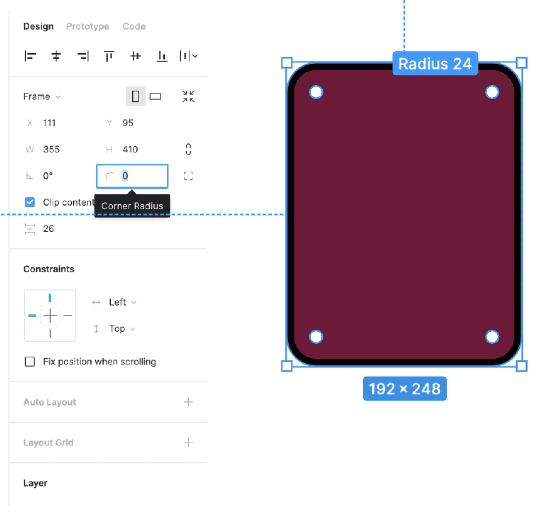
Understanding how to modify the corner radius is a fundamental skill for any designer using Figma. These are the basic steps to adjust corner radius, helping you achieve the perfect look for your elements.

Select the layer in the canvas or Layers panel.
Enter a pixel value in the Corner Radius field
OR hover over the corner you want adjust until the radius handle appears.
Figma offers flexibility when it comes to corner radius, allowing you to change each corner individually. Here, we'll explore how to apply different radii to individual corners, giving your designs a unique touch.
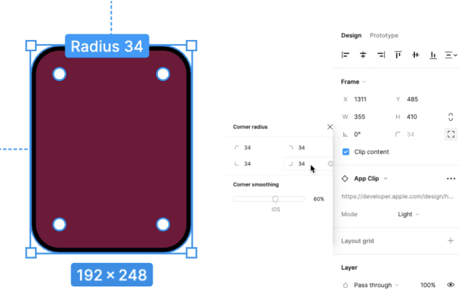
Select the layer in the canvas or Layers panel.
Click the Independent corners icon to open the Corner radius panel.
In the Corner radius panel, you can:
Enter a pixel value for corner radius in the Top left corner radius, Top right corner radius, Bottom left corner radius, and Bottom right corner radius fields.
OR hold down the modifier key to adjust a single corner
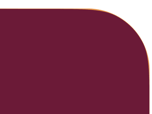
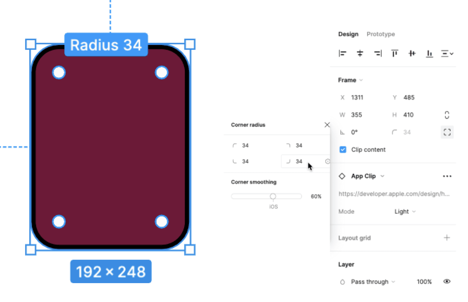
Corner smoothing, made popular by iOS app icons, adds a modern touch to your designs. I will show you how to combine corner radius with corner smoothing in Figma, inspired by the sleek edges of today's app interfaces.
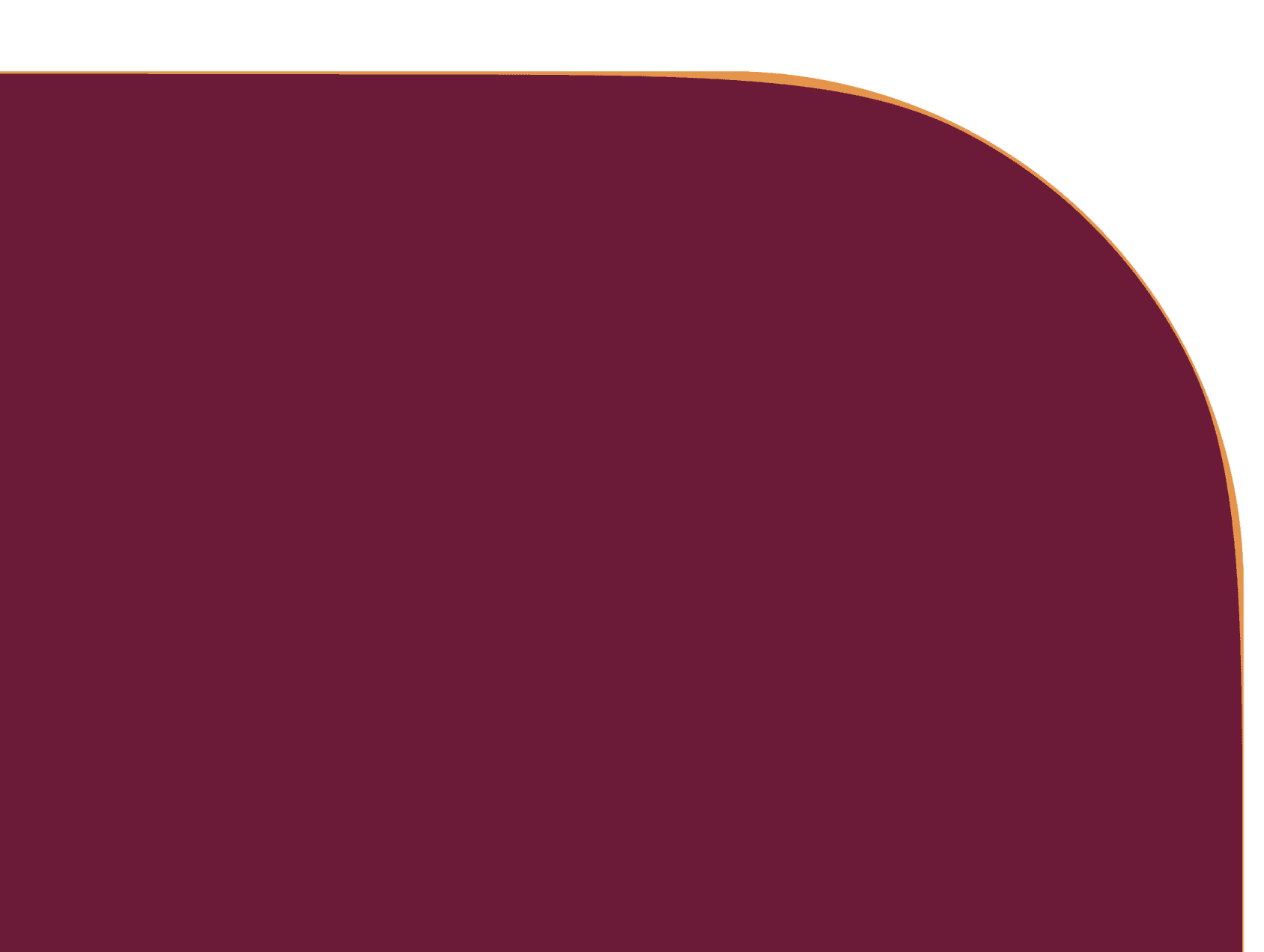
Our eyes naturally follow circles and curves, making them easier to process than sharp edges. We frequently see both natural and manufactured objects with rounded corners, which appear softer, friendlier, and safer.
How does Figma help with that?
Corner Radius: Rounds the corners where two lines meet, creating shapes with rounded edges.
Corner Smoothing: Adjusts corners for a continuous curve, useful for making "squircles"; a shape that's somewhere between a square and a circle.
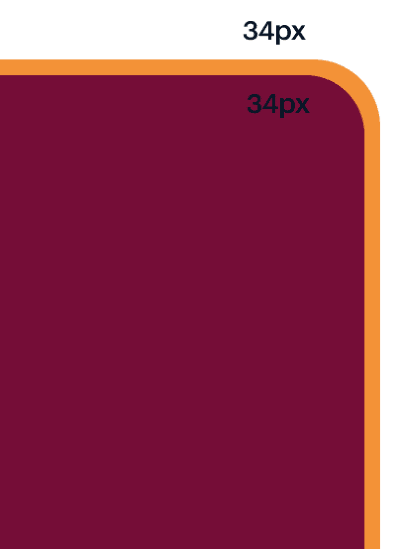
Corner radius: 34
Corner smoothing: 0%
Corner radius: 34
Corner smoothing: 60%
Apple's iOS7 introduced icons with rounded corners, a shape between a square and a circle, which continues in iOS14 with a 60% standard radius.
The corner radius of your Call to Action (CTA) buttons can significantly impact their effectiveness. Here, you’ll see how different radii can influence user behavior and how to optimize your CTAs for better engagement.
Radius at 0px
Call to action
It conveys stability and seriousness, giving a sense of security and showing professionalism.
Radius at 4px
Call to action
It embodies a professional spirit without being strict, creating a welcoming design.
Use less than 6px border radius for enterprises and corporates.
Radius at 6-12px
Call to action
It's rare and considered innovative, but it can lead to imbalance and inconsistency in an interface. Careful use is essential.
Radius circular
Call to action
It's rare and considered innovative yet common in interfaces, creating a user-friendly and creative atmosphere. Curves naturally attract the eye, making buttons with rounded corners easier to read and detect. Amid straight lines, a rounded button catches the eye. However, using rounded corners on all components can be complex; they work well for buttons but may not suit form fields. It's best to use them sparingly and combine them with other design elements for balance.
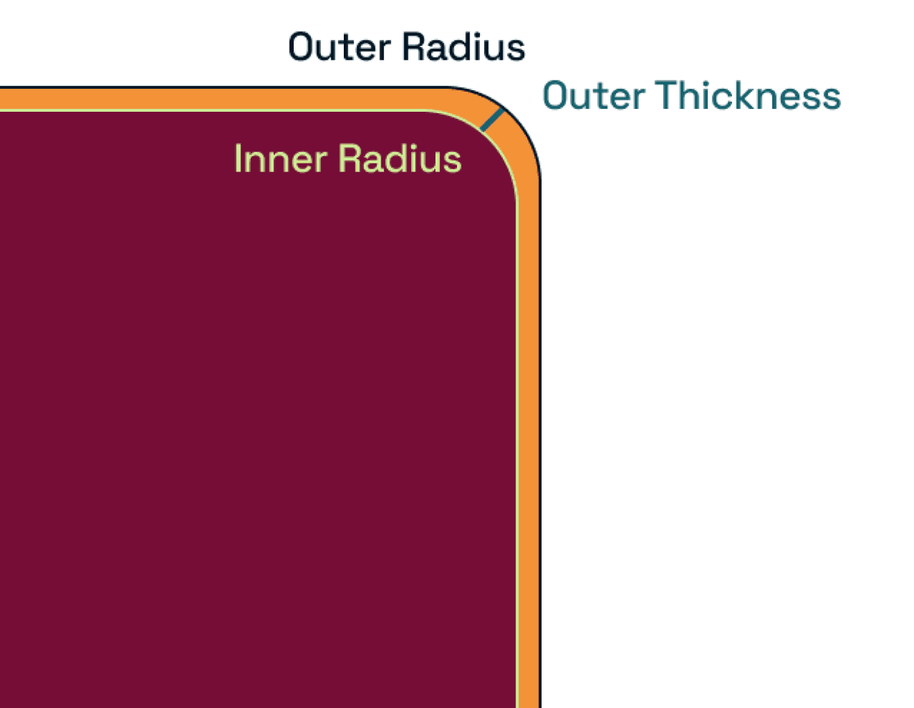
Achieving the perfect inner radius can be tricky, but with the right formula, it becomes a breeze. This a straightforward method to calculate the inner radius, ensuring consistency and precision in your designs.
Don't
Use the same corner radius for both
parent and child element.
Do
Use an adjusted corner radius for the
inner element.
Use the following formula to calculate the perfect corner radius for your inner element.
Inner radius = Outer radius - Outer thickness/2
Start designing your project
Feel free to reach out to discuss your ideas.
How Border Radius Works
How Border Radius Works
Designers often overlook the subtle details that can significantly impact the user experience, and one such detail is the corner radius. In this guide, we will explore how to effectively use corner radius in Figma to enhance your designs, ensuring they are not only aesthetically pleasing but also highly functional.
Understanding how to modify the corner radius is a fundamental skill for any designer using Figma. These are the basic steps to adjust corner radius, helping you achieve the perfect look for your elements.
Select the layer in the canvas or Layers panel.
Enter a pixel value in the Corner Radius field

OR hover over the corner you want adjust until the radius handle appears.
Figma offers flexibility when it comes to corner radius, allowing you to change each corner individually. Here, we'll explore how to apply different radii to individual corners, giving your designs a unique touch.
Select the layer in the canvas or Layers panel.
Click the Independent corners icon to open the Corner radius panel.
In the Corner radius panel, you can:
Enter a pixel value for corner radius in the Top left corner radius, Top right corner radius, Bottom left corner radius, and Bottom right corner radius fields.
OR hold down the modifier key to adjust a single corner
Corner smoothing, made popular by iOS app icons, adds a modern touch to your designs. I will show you how to combine corner radius with corner smoothing in Figma, inspired by the sleek edges of today's app interfaces.
Our eyes naturally follow circles and curves, making them easier to process than sharp edges. We frequently see both natural and manufactured objects with rounded corners, which appear softer, friendlier, and safer.
How does Figma help with that?
Corner Radius: Rounds the corners where two lines meet, creating shapes with rounded edges.
Corner Smoothing: Adjusts corners for a continuous curve, useful for making "squircles"; a shape that's somewhere between a square and a circle.
Corner radius: 34
Corner smoothing: 60%
Apple's iOS7 introduced icons with rounded corners, a shape between a square and a circle, which continues in iOS14 with a 60% standard radius.
Corner radius: 34
Corner smoothing: 0%
The corner radius of your Call to Action (CTA) buttons can significantly impact their effectiveness. Here, you’ll see how different radii can influence user behavior and how to optimize your CTAs for better engagement.
Radius at 0px
Call to action
It conveys stability and seriousness, giving a sense of security and showing professionalism.
Radius at 4px
Call to action
It embodies a professional spirit without being strict, creating a welcoming design.
Use less than 6px border radius for enterprises and corporates.
Radius at 6-12px
Call to action
It's rare and considered innovative, but it can lead to imbalance and inconsistency in an interface. Careful use is essential.
Radius circular
Call to action
It's rare and considered innovative yet common in interfaces, creating a user-friendly and creative atmosphere. Curves naturally attract the eye, making buttons with rounded corners easier to read and detect. Amid straight lines, a rounded button catches the eye. However, using rounded corners on all components can be complex; they work well for buttons but may not suit form fields. It's best to use them sparingly and combine them with other design elements for balance.
Achieving the perfect inner radius can be tricky, but with the right formula, it becomes a breeze. This a straightforward method to calculate the inner radius, ensuring consistency and precision in your designs.
Don't
Use the same corner radius for both
parent and child element.
Do
Use an adjusted corner radius for the
inner element.
Use the following formula to calculate the perfect corner radius for your inner element.
Inner radius = Outer radius - Outer thickness/2
Use the following formula to calculate the perfect corner radius for your inner element.
Inner radius = Outer radius - Outer thickness/2
Start designing your project
Feel free to reach out to discuss your ideas.
Start designing your project
Feel free to reach out to discuss your ideas.