How Color Works
Part 1
How Color Works
Part 1
How Color Works
Part 1
Meaningful use of colors
Meaningful use of colors
Meaningful use of colors
Color sets the mood & emotion which can affect how users interact with an app.
Color sets the mood & emotion which can affect how users interact with an app.
Red
Red
Urgency, Excitement, Action
Urgency, Excitement, Action
Why?
Why?
Red is an attention-grabber, making users feel energized.
Red is an attention-grabber, making users feel energized.
How it’s used?
How it’s used?
YouTube and Netflix use red to create a sense of excitement and urgency (binge-watching behavior).
YouTube and Netflix use red to create a sense of excitement and urgency (binge-watching behavior).
Start designing your project
Feel free to reach out to discuss your ideas.
Blue
Blue
Trust, Security, Professionalism
Trust, Security,Professionalism
Why?
Why?
Blue is calming and associated with reliability.
Blue is calming and associated with reliability.
How it’s used?
How it’s used?
Social networks and finance apps use blue to appear credible and safe.
Social networks and finance apps use blue to appear credible and safe.
Green
Green
Success, Health, Growth
Success, Health, Growth
Why?
Why?
Green is linked to positive reinforcement and relaxation.
Green is linked to positive reinforcement and relaxation.
How it’s used?
How it’s used?
Spotify’s green hints at a seamless, enjoyable experience, while WhatsApp uses it for trust and well-being.
Spotify’s green hints at a seamless, enjoyable experience, while WhatsApp uses it for trust and well-being.
Yellow
Yellow
Energy, Attention, Happiness
Energy, Attention, Happiness

Why?
Why?
Yellow stimulates creativity and grabs attention.
Yellow stimulates creativity and grabs attention.
How it’s used?
How it’s used?
Snapchat’s yellow makes the app feel fun and spontaneous, while McDonald's uses yellow to stimulate appetite.
Snapchat’s yellow makes the app feel fun and spontaneous, while McDonald's uses yellow to stimulate appetite.
Purple
Purple
Luxury, Creativity, Uniqueness
Luxury, Creativity, Uniqueness

Why?
Why?
Purple is associated with imagination and exclusivity.
Purple is associated with imagination and exclusivity.
How it’s used?
How it’s used?
Twitch uses purple to emphasize creativity and gaming culture.
Twitch uses purple to emphasize creativity and gaming culture.
Black & White
Black & White
Minimalism, Elegance, Simplicity
Minimalism, Elegance,Simplicity
Why?
Why?
Black/white schemes convey premium and timeless design.
Black/white schemes convey premium and timeless design.
How it’s used?
How it’s used?
Apple keeps its UI sleek and distraction-free, reinforcing its brand identity.
Apple keeps its UI sleek and distraction-free, reinforcing its brand identity.
Functional use of colors
Functional use of colors
Functional use of colors
How different color roles impact clarity, usability and branding.
How different color roles impact clarity, usability and branding.
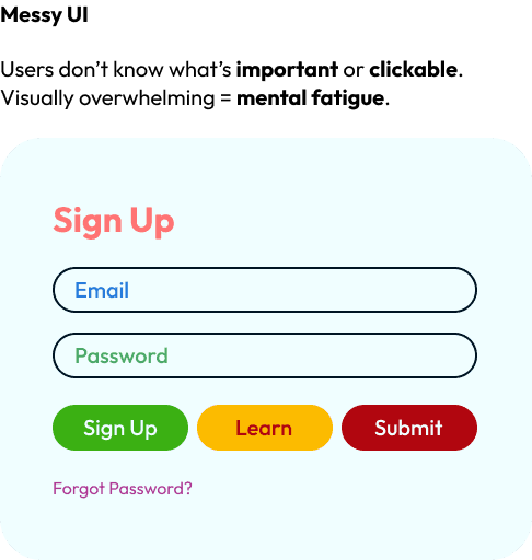
Why Color Hierarchy Matters
Why Color Hierarchy Matters
Using colors with intention creates a clear visual structure and guides user focus. Without it, interfaces feel chaotic or confusing.
Using colors with intention creates a clear visual structure and guides user focus. Without it, interfaces feel chaotic or confusing.
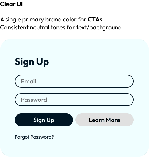

Primary Colors – The Main Driver
Primary Colors – The Main Driver
Used for key actions (like CTAs), logo/brand color, or anything the user should focus on immediately.
Used for key actions (like CTAs), logo/brand color, or anything the user should focus on immediately.


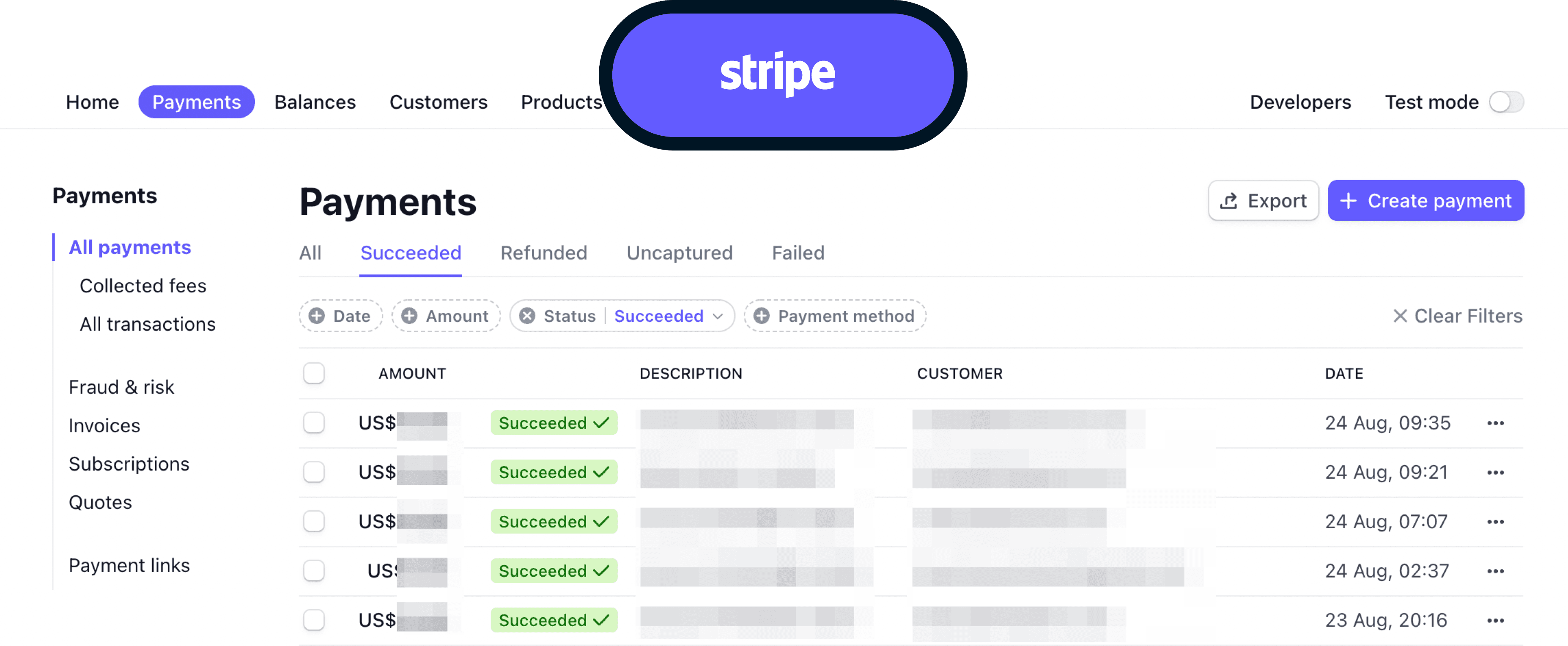
Secondary Colors – Supportive Yet Subtle
Secondary Colors – Supportive Yet Subtle
Complement the primary, guide secondary actions like "Learn More" or category tags.
It often appears in muted tones, ensuring they are noticeable yet not competing with primary calls-to-action.
Complement the primary, guide secondary actions like "Learn More" or category tags.
It often appears in muted tones, ensuring they are noticeable yet not competing with primary calls-to-action.

Accent Colors – Draw the Eye
Accent Colors – Draw the Eye
Used sparingly to highlight alerts, links, ratings, or progress.
Used sparingly to highlight alerts, links, ratings, or progress.
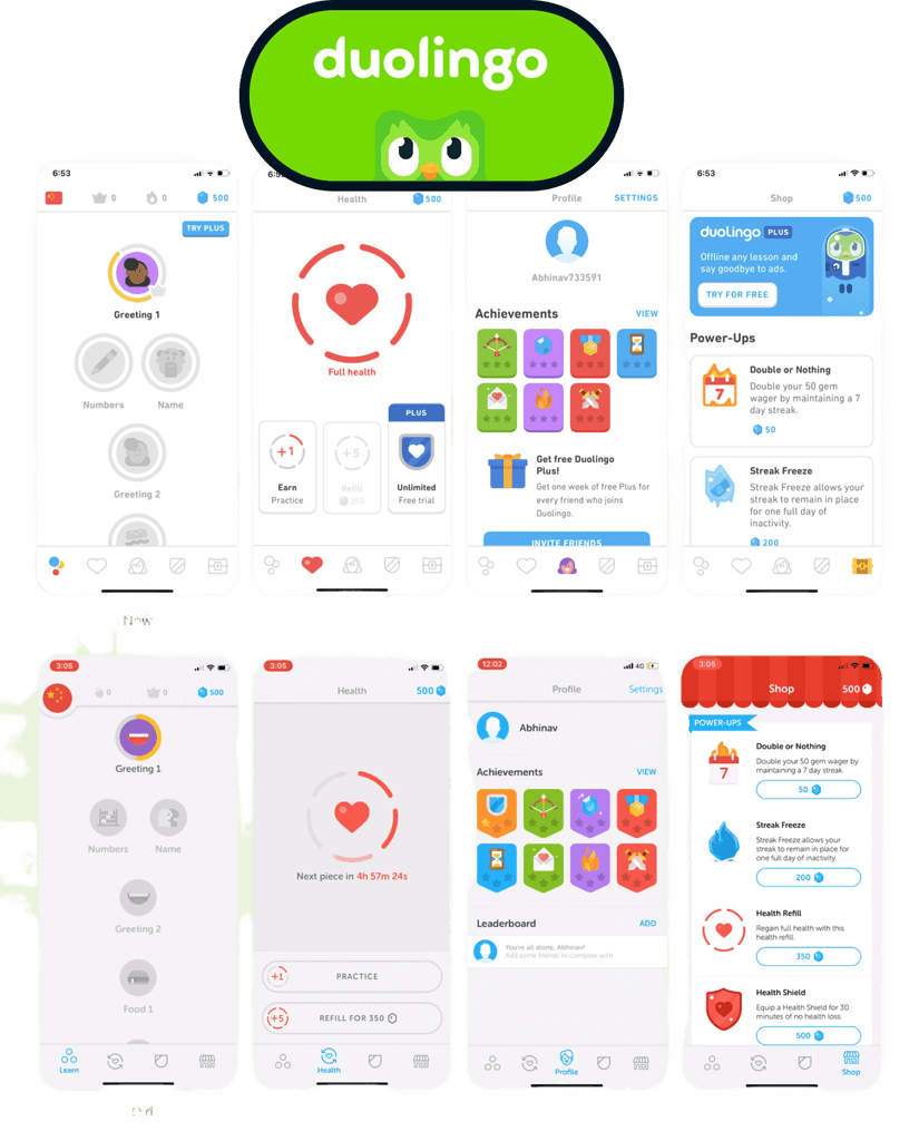
Neutral Colors – The Unsung Heroes
Neutral Colors – The Unsung Heroes
Used for text, backgrounds, dividers. They let primary elements shine while keeping everything readable and balanced.
Used for text, backgrounds, dividers. They let primary elements shine while keeping everything readable and balanced.
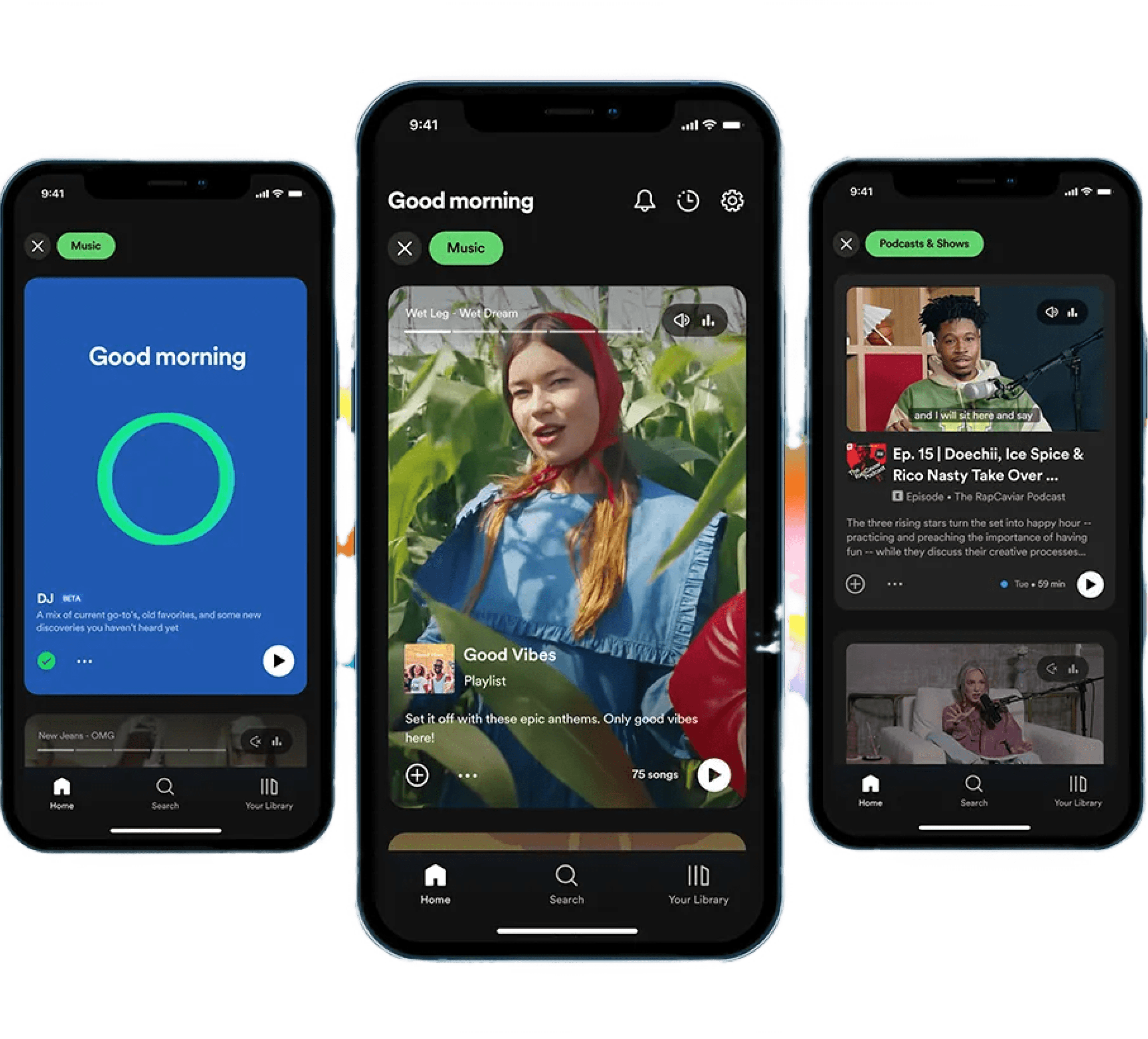
Dark grays and blacks are predominantly used for backgrounds, providing a modern and immersive feel.
Dark grays and blacks are predominantly used for backgrounds, providing a modern and immersive feel.
White and light gray colors are employed for text and icons, ensuring readability and clear navigation against the darker backgrounds.
White and light gray colors are employed for text and icons, ensuring readability and clear navigation against the darker backgrounds.
The signature Spotify Green is used sparingly to draw attention to active elements like the play button and progress bars.
The signature Spotify Green is used sparingly to draw attention to active elements like the play button and progress bars.
Start designing your project
Feel free to reach out to discuss your ideas.
Start designing your project
Feel free to reach out to discuss your ideas.